Dive into the fascinating world of typography, where art and science converge to shape visual communication. Explore the nuances of fonts and their impact on design. From classic serifs to modern sans-serifs, uncover the secrets of effective typography.
Introduction:
Typography, the art and science of arranging type to make written language both readable and visually appealing, is an essential component of design and communication. Fonts, or typefaces, are the building blocks of typography, playing a crucial role in conveying meaning, evoking emotions, and leaving a lasting impression. In this article, we’ll delve into the fascinating world of fonts and typography, exploring their history, the psychology behind them, and their impact on design and communication.
A Brief History of Typography
Typography has a rich and storied history that dates back centuries. In the early days of written language, text was often handwritten and illuminated by scribes. The first major advancement in typography came with the invention of the printing press by Johannes Gutenberg in the 15th century. This revolutionary invention allowed for mass production of books and documents, making written knowledge more accessible to the masses.
As the field of typography developed, various typefaces were created to meet specific needs and aesthetic preferences. Fonts like Garamond, Baskerville, and Helvetica have become iconic in their own right, influencing design and typography for generations. In the digital age, typography has continued to evolve, with countless fonts available for use in print and online media.
The Art of Font Selection
Choosing the right font is a critical aspect of design. Each font has its own personality and conveys a unique message. Here are some key considerations when selecting fonts for a project:
1. Legibility: The primary purpose of typography is to convey a message, so legibility is paramount. Fonts should be easy to read and understand. Factors such as character spacing, line height, and font size all impact legibility.
2. Alignment with Brand and Message: Fonts should align with the brand or message being conveyed. A whimsical, script font may be inappropriate for a serious financial report, while a classic serif font might not be suitable for a children’s book.
3. Hierarchy: Effective typography establishes a hierarchy that guides readers through a piece of content. Headings, subheadings, and body text should use different fonts and styles to help readers navigate and understand the content.
4. Visual Appeal: Fonts contribute to the visual aesthetics of a design. Different fonts can evoke different emotions and set the tone for a piece. For example, a playful font might be ideal for a birthday invitation, while a sleek, modern font may be better suited for a tech company’s website.
5. Consistency: Consistency in font usage is essential for creating a polished and professional look. Stick to a limited number of fonts within a design to maintain a cohesive appearance.
The Psychology of Fonts
Fonts have a profound impact on the way people perceive and interpret written content. The psychology of fonts explores how different typefaces can influence emotions, attitudes, and behaviours. Here are a few examples:
1. Serif vs. Sans Serif: Serif fonts, with small decorative lines at the ends of characters, are often associated with tradition, reliability, and formality. In contrast, sans-serif fonts are viewed as modern, clean, and straightforward.
2. Font Weight: The weight of a font (e.g., bold, regular, light) can convey strength, emphasis, or delicacy. Designers often use bold fonts for headings to grab attention, while finding lighter fonts more suitable for body text.
3. Script Fonts: Script fonts, with their flowing, handwritten appearance, are often associated with elegance, creativity, and personalization. They are frequently used for invitations and artistic branding.
4. Geometric Fonts: Fonts with precise, geometric shapes convey a sense of order, minimalism, and a contemporary feel. They are popular in modern design and technology.
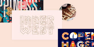
5. Display Fonts: Display fonts are highly decorative and often used for attention-grabbing headlines or logos. They can convey a sense of uniqueness and creativity.
Typography in the Digital Age
The digital age has transformed the world of typography. With the advent of the internet and a vast array of design software, designers have more fonts at their disposal than ever before. Web designers, in particular, must consider legibility across various devices and screen sizes.
Responsive web design and the use of web fonts have become essential in ensuring a consistent and readable experience for users.
Google Fonts and Adobe Typekit offer a wide selection of web fonts that designers can easily integrate into websites, providing more flexibility in creating web content. Furthermore, mobile devices and social media have added new dimensions to typography. Emojis, animated text, and the use of multiple fonts within a single design are now common practices, especially on platforms like Instagram and TikTok. These developments demonstrate the enduring relevance of typography in the digital age.
Fonts and typography are more than just the icing on the cake of design; they are the very essence of written communication.
The selection of fonts can influence how people perceive, emotionally receive, and act upon information. In a world where visual content and design play an increasingly significant role, a deep understanding of typography is a valuable skill for designers, writers, and communicators.
By harnessing the power of fonts and typography, we can create designs that inform, inspire, and captivate audiences in an ever-evolving digital landscape.
FAQs
Q1: What is typography, and why is it essential in design?
A1: Typography is the art and technique of arranging type to make written language readable and visually appealing. It is essential in design because it plays a significant role in conveying messages, setting the tone, and influencing user experience.
Q2: How do different fonts impact communication?
A2: Different fonts evoke distinct emotions and convey specific messages. Serif fonts often exude tradition and formality, while sans-serif fonts offer a modern and clean aesthetic. Choosing the right font is crucial in aligning design with the intended message.
Q3: What is the difference between serif and sans-serif fonts?
A3: The main difference lies in the presence or absence of small lines, or serifs, at the end of characters. Serif fonts, like Times New Roman, have these decorative strokes, conveying a classic feel. Sans-serif fonts, such as Arial, lack these strokes, presenting a more modern and minimalist appearance.
Q4: How can I choose the right font for my design project?
A4: Consider the mood and purpose of your project.
Serif fonts may suit formal documents, while contemporary designs often prefer sans-serif fonts. Additionally, ensure readability and maintain consistency for a polished look.
Q5: Are there trends in typography, and how do they evolve?
A5: Yes, typography trends evolve over time. Currently, minimalist and expressive typography are popular. Keeping an eye on design communities, attending conferences, and exploring online resources can help you stay updated on emerging trends.